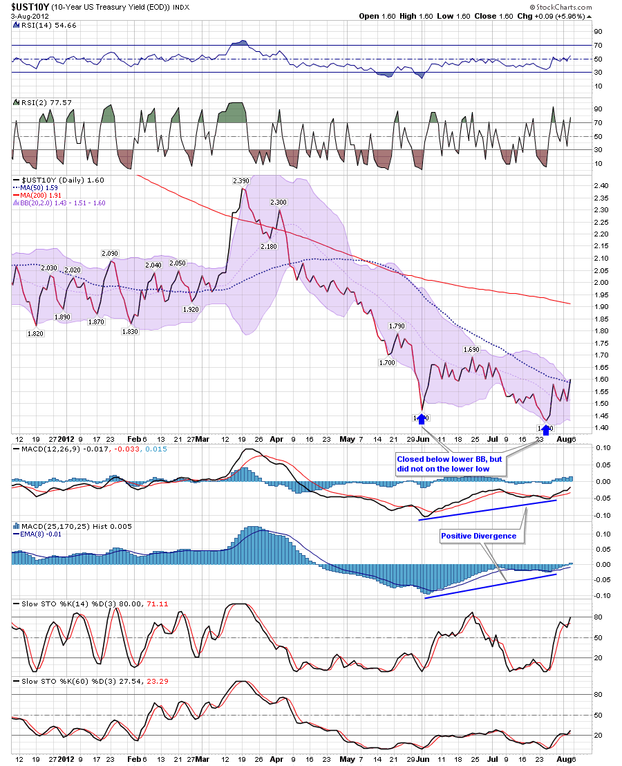
Here’s a few charts of the 10 year treasury yield. Chart #1 below shows you a chart of the 10 year Treasury Yield, as you know it recently rallied off the divergent low and bull wedge that had formed.
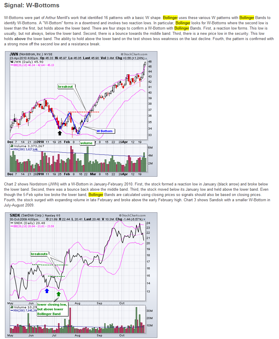
The second item below shows a graphic exerpt from the Stockchart.com Education section on Bollinger Bands (Here’s a URL to the Stockcharts.com Education section which discusses Bollinger Bands and John Bollinger who created Bollinger Bands, in greater detail), it shows two bullish examples of when a stock forms a lower lower, however does not close below the Bollinger Bands on the lower low. This is something we also showed in April as an educational piece.
However as you see in the chart below the graphic, which shows another daily 10 year yield chart but this time I include the Bollinger Bands, note that a similar thing also occurred with the recent divergent low i.e. price closed below the Bollinger Bands in early June, but did not in late July when a lower low was established.
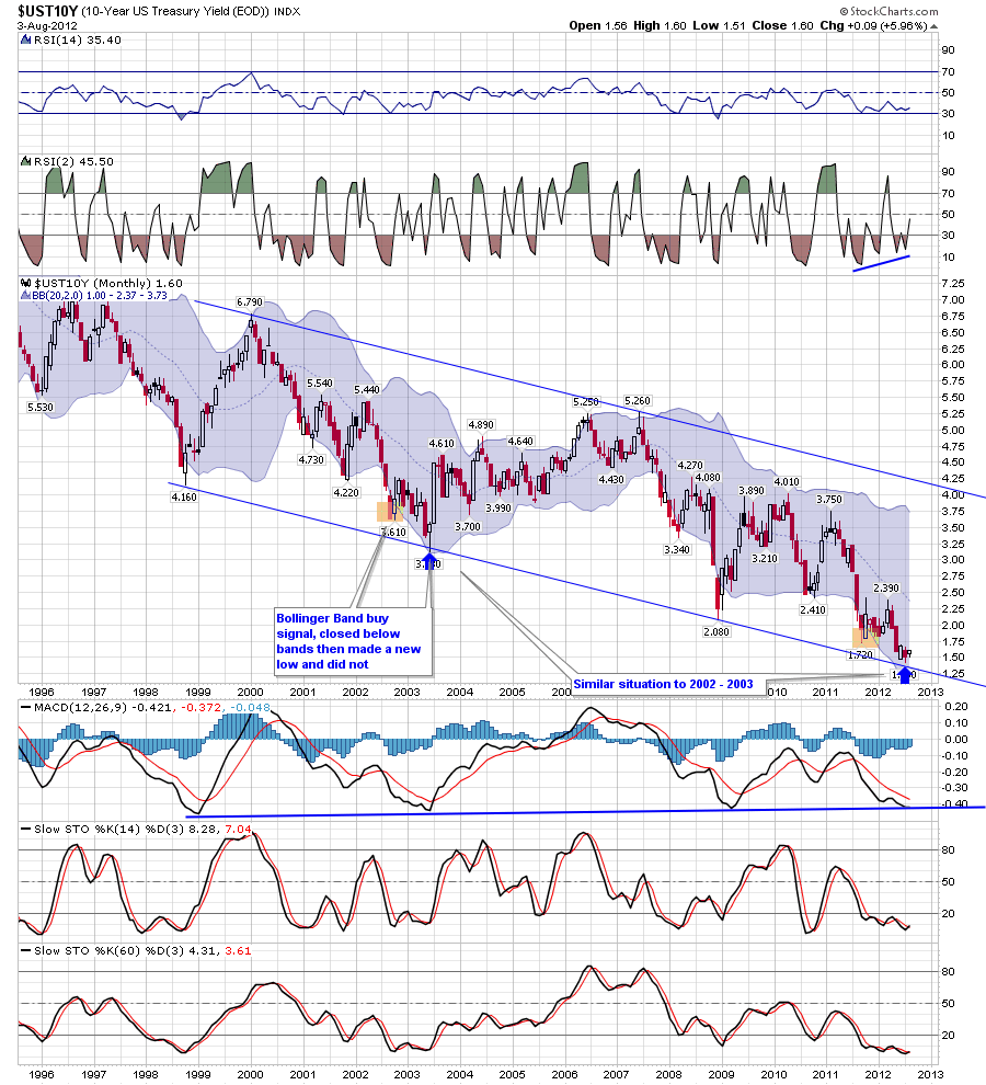
Charts 4 – Also note you also have a similar thing occurring on the long term monthly chart.
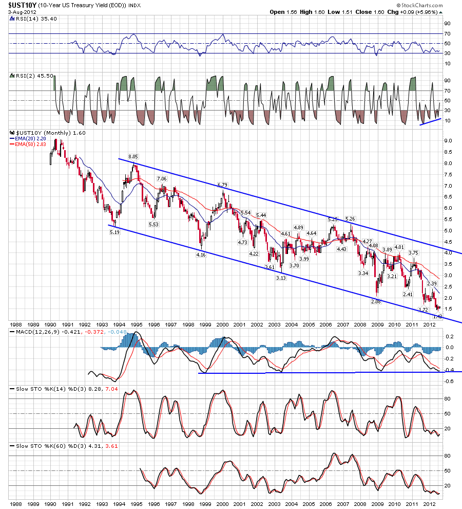
Chart 5 – I also show a 25 year long term chart as well